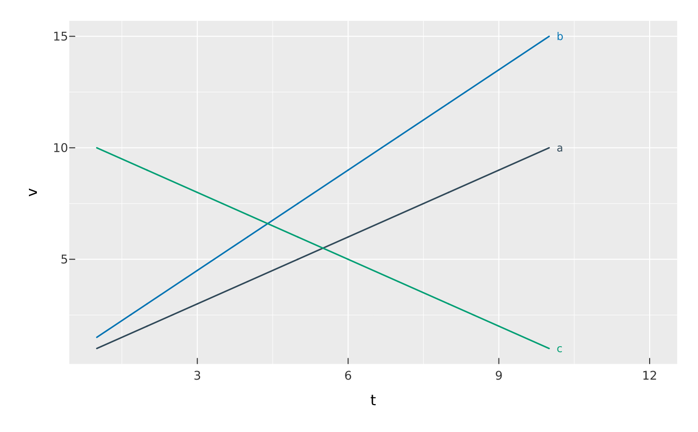
mark_series_label() labels each colour/fill series at its end (the point
with the largest x) with the series name — a legend-free alternative that
reads faster on a multi-line chart. Labels are pushed apart with the same
repel solver as mark_text(). Map the same x/y/color as the lines; the
label text and colour come from the series automatically.
Usage
mark_series_label(
  plot,
  ...,
  size = NULL,
  nudge_x = 2,
  repel = TRUE,
  box_padding = 1,
  min_segment_length = 2,
  blend = NULL,
  data = NULL
)
Arguments
- plot
- ...
Encodings (tidy-eval): the same
x,y, andcolor/fillas the series being labelled.- size
Font size in points.
- nudge_x
Rightward offset (mm) so a label clears its line end (default
2). Widen the x range (orcoord_cartesian(clip = FALSE)) if labels crowd the panel edge.- repel
Move overlapping labels apart (force-directed, ggrepel-style), with leader lines to the points? Single cartesian panel only.
- box_padding
Extra space (mm) kept around each label box during repulsion.
- min_segment_length
Shortest leader line (mm) worth drawing; a label that barely moved gets none.
- blend
Optional blend mode for compositing this layer against what is already drawn beneath it (the panel and earlier layers), one of the CSS
mix-blend-modenames, e.g."multiply","screen","darken". The whole layer composites as one isolated group (not per element).- data
Optional layer data frame; overrides the plot data for this layer.
Value
The modified PlotSpec.
Examples
d <- data.frame(
  t = rep(1:10, 3), v = c(1:10, (1:10) * 1.5, 10:1),
  s = rep(c("a", "b", "c"), each = 10)
)
# Give the panel a little x-room and drop the now-redundant colour legend.
vplot(d) |>
  mark_line(x = t, y = v, color = s) |>
  mark_series_label(x = t, y = v, color = s) |>
  xlim(1, 12) |>
  guides(color = "none")