
Scatter plots break down long before you run out of memory. Past a few tens of thousands of overlapping points, markers stop landing on empty canvas and start landing on each other. The picture saturates: you can no longer tell a region with a thousand points from one with a million, and drawing every marker only gets slower. This is overplotting, and no amount of transparency fully fixes it.
Datashading takes a different route. Instead of drawing points, it bins them into a grid sized to the output, counts how many fall in each cell, and colours each cell by that count. The result is a single raster whose cost is set by the grid resolution, not the number of points. Ten thousand points or ten million, the image takes about the same time to make, and density is shown honestly because it is measured rather than implied by overlap.
In vellumplot this is mark_datashade(). It bins x and y into a width-by-height canvas in one pass and colours each cell by density, drawing one raster that fills the panel. The binning itself is done by the backend’s vellum::datashade(), whose datashading article covers the aggregation engine, the reductions, and the equalisation options in depth. Because the cell colour encodes density, per-point aesthetics like colour and size do not apply. The statistical marks article introduces it on a synthetic half-million points; here we push it as far as it goes.
The US Census, about 306 million points
The canonical stress test for datashading is the datashader US Census example: one point per person from the 2010 US Census, roughly 306 million rows, each tagged with a location and a race. It is far too many points to plot as markers, and it is a good showcase precisely because the interesting structure lives across an enormous dynamic range, from empty desert to dense city cores.
The figures below are produced by inst/examples/19-datashader-census.R. That script is a heavy showcase, not a quick example: it downloads a 1.44 GB Parquet dataset once and needs several gigabytes of RAM for the full run (you can set an n_max in the script to smoke-test on a spatial subset first). The images here are scaled down from the full-resolution exports.
Population density
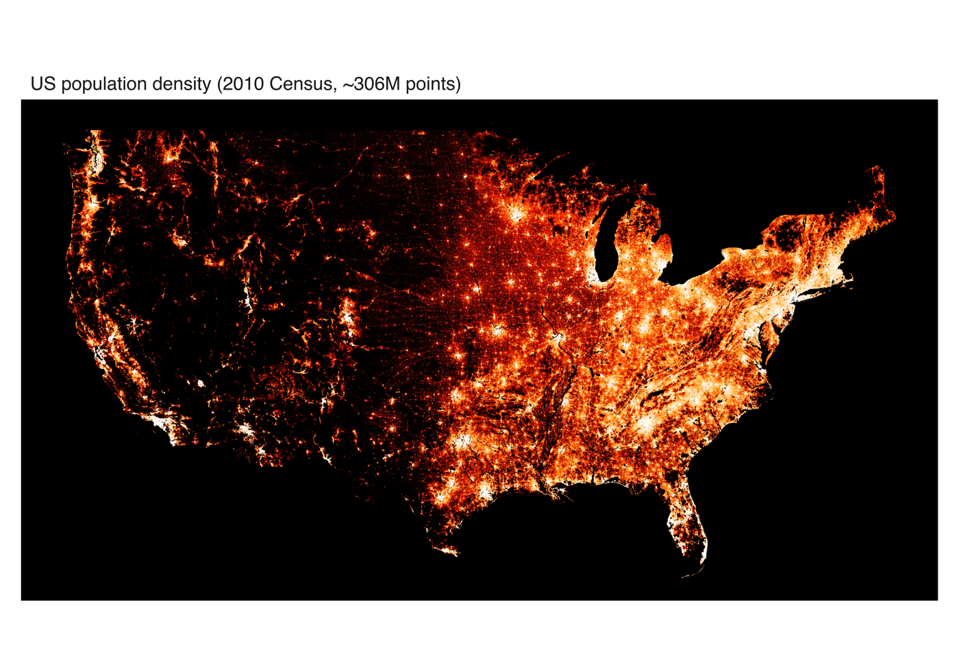
The first map shades every person by local population density on a single colour ramp, with histogram equalisation (how = "eq_hist") to spread that huge dynamic range across the ramp so both sparse and dense regions stay legible. It is the classic “where do people live” map, and the whole country emerges from a third of a billion anonymous points.
Coloured by race
The second map colours the same points by race. Map a discrete color aesthetic and mark_datashade() shades categorically — datashader’s count_cat — in one call:
vplot(census) |>
  mark_datashade(x = easting, y = northing, color = race)
Each race is aggregated into its own count grid in the same single pass, and every cell is coloured by the count-weighted average of the hues it holds, with opacity from its total density. Where one group dominates a cell you get that group’s hue; where groups overlap the hues mix — so the segregation and mixing patterns of American cities read directly off the colour, and you get a colour legend for free. The hues come from the ordinary discrete colour scale, so scale_color_manual() (or any scale_color_*()) sets them.
(Before this was a single call, the same map was built by hand — one mark_datashade() layer per race, each ramping from black to its hue, composited with blend = "screen" on a black panel. The blend route still works and remains useful for bespoke compositing, but color = race is the direct way.)
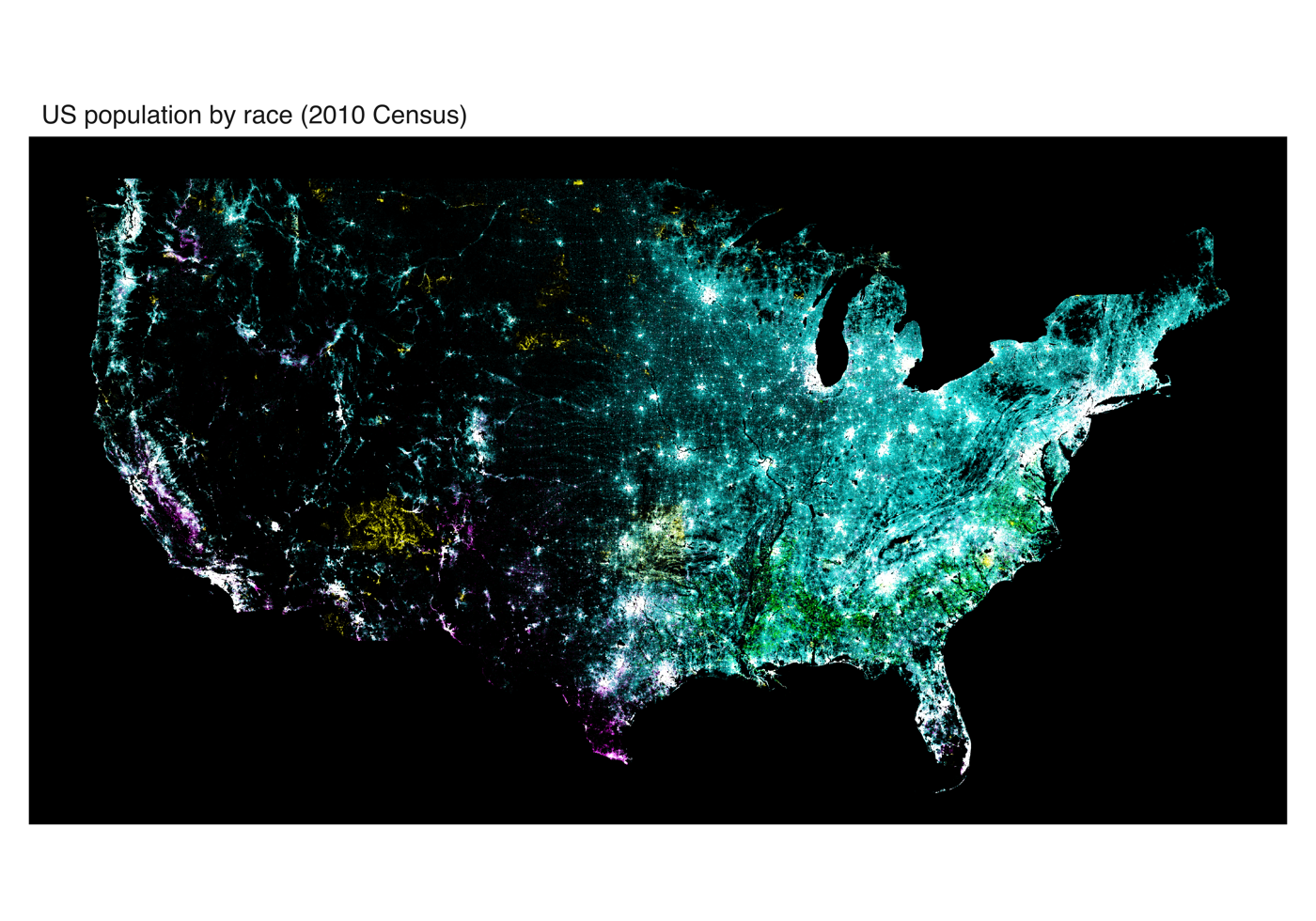
count_cat) datashading, each cell coloured by the count-weighted mix of the races present and shaded by density.Beyond points: dense lines and network hairballs
Overplotting is not unique to scatter plots. A few hundred thousand line vertices — a stack of many timeseries — collapse into a solid band, and the edges of a large graph collapse into an unreadable “hairball”. The same aggregate-then-shade idea works there: rasterise the lines into a canvas-sized grid where each cell records how many lines cross it, and shade by that coverage. The backend does this with vellum::datashade_lines() (connected polylines) and vellum::datashade_segments() (independent segments).
You reach it the same way mark_point() reaches datashading: an auto = TRUE switch. Below the threshold the mark draws ordinary vectors; above it, it rasterises. mark_line() and mark_step() fall back to a line-density raster, mark_segment() and mark_edges() to a segment-density one.
# A dense stack of timeseries: many series, packed into one raster.
vplot(walks) |>
  mark_line(x = t, y = value, color = series, auto = TRUE)
For a line layer, the color (and alpha / linetype) mapping still defines where one series ends and the next begins — the raster never joins two series with a spurious segment — but because the cells encode line density, colour no longer sets a per-series hue; the whole field ramps from low to high coverage.
For a graph, drop auto = TRUE on the edge layer and the hairball becomes an honest edge-density field:
vgraph(g) |>
  mark_edges(auto = TRUE) |>
  mark_nodes(size = 2)
The rasterised edges are drawn in data space, so the device-space niceties of the vector edge path — parallel-edge offsets, node-boundary caps, arrowheads, teardrop self-loops — do not apply. That detail is exactly what you do not want on a graph too dense to read edge-by-edge; keep the vector path for graphs small enough to benefit from it.
Keeping thin marks visible: spread
A rasterised line or segment is often a single pixel wide, and single-pixel marks disappear when the image is shown small or on a busy background. datashader solves this with spreading: dilate each shaded pixel over a small neighbourhood. Datashaded lines and segments therefore default to spread = "auto", which uses vellum::dynspread() to choose a radius from the image’s own density — sparse regions spread more, dense ones less, so everything stays legible.
Point datashading keeps its raw, unspread output by default, but you can opt in on mark_datashade(): pass a positive integer for a fixed radius (vellum::spread()) or "auto" for dynamic spreading.
vplot(d) |>
  mark_datashade(x = x, y = y, spread = 2)     # fixed 2-pixel dilation
Resolution: aggregation, not dpi
One practical lesson from the census script is worth stating on its own, because it trips people up. There are two different resolutions in play, and they are not interchangeable:
- The aggregation resolution is the
widthandheightyou pass tomark_datashade(). This is the size of the grid the points are counted into, and it sets how much detail the shaded map actually contains. - The page resolution is
width * dpifromvplot(). This only rescales the finished raster.
A high dpi over a small aggregation grid just upsamples a small image, so it looks blurry. For a genuinely high-resolution export you have to raise the aggregation width/height and give the page enough pixels that the panel is at least that wide, so the raster is drawn close to one-to-one rather than stretched. The census figures use a 5000-wide aggregation grid on a 6000-pixel page for exactly this reason.
When to reach for it
Datashading is the answer whenever a layer has so many rows that individual markers are neither informative nor fast: dense scatter plots, GPS traces, event logs, particle simulations, dense timeseries, large graphs. mark_point(), mark_line(), mark_step(), mark_segment(), and mark_edges() all take an auto = TRUE switch that falls back to the appropriate datashaded raster automatically past a row threshold, so you can keep writing the ordinary mark and let vellumplot pick the representation. For the full argument list, see the mark_datashade() reference, and for the aggregation engine underneath it, vellum’s datashading article.