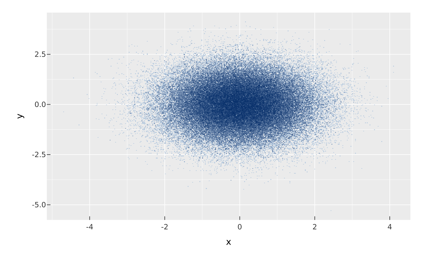
For data too dense to draw one marker each (overplotted, up to millions of
points), mark_datashade() bins the points into a canvas-sized grid in one
pass and colours each cell by density (via vellum::datashade()), drawing a
single raster that fills the panel. Cost is decoupled from point count and
overplotting.
Usage
mark_datashade(
  plot,
  ...,
  width = 400,
  height = 300,
  colors = NULL,
  how = "eq_hist",
  span = NULL,
  clip = NULL,
  spread = NULL,
  blend = NULL,
  data = NULL
)
Arguments
- plot
- ...
Encodings;
xandyare required. Mapcolor/fillto a discrete variable for categorical (count_cat) shading.- width, height
Aggregation grid size in cells (output raster pixels).
- colors
Two or more colours forming the low-to-high density ramp (plain density shading only; ignored when a
color/fillaesthetic is mapped).- how
Density-to-colour mapping (and, categorically, per-cell opacity):
"eq_hist"(default),"log","cbrt", or"linear".- span, clip
Optional density-range clamping passed to
vellum::datashade():span = c(lo, hi)absolute limits, orclip = c(0.01, 0.99)percentiles, so a few extreme cells don't flatten the rest. Both defaultNULL.- spread
Optional post-aggregation spreading to keep sparse output visible (passed to
vellum::datashade()):NULL(default) none — the raw one-pass aggregation; a positive integer dilates each shaded pixel by that radius (vellum::spread());"auto"picks the radius from the image density (vellum::dynspread()). Datashaded lines/segments (auto = TRUEonmark_line()/mark_segment()etc.) default to"auto"since single-pixel lines otherwise vanish.- blend
Optional blend mode for compositing this layer against what is already drawn beneath it (the panel and earlier layers), one of the CSS
mix-blend-modenames, e.g."multiply","screen","darken". The whole layer composites as one isolated group (not per element).- data
Optional layer data frame; overrides the plot data for this layer.
Value
The modified PlotSpec.
Details
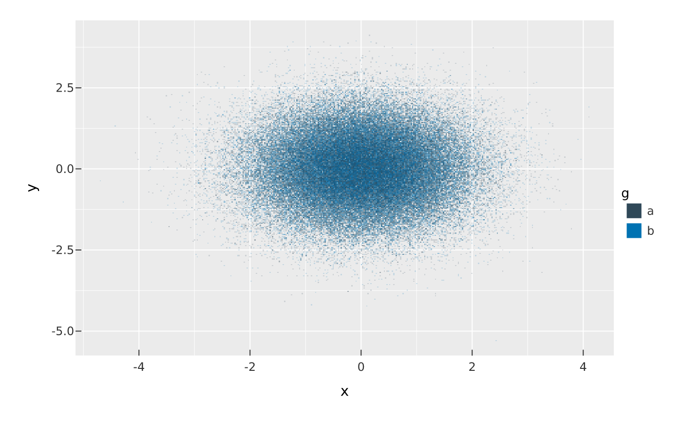
Map a discrete color (or fill) aesthetic to shade categorically
(datashader's count_cat): each category is aggregated separately and every
cell is coloured by the count-weighted average of the category hues it holds,
with opacity from its total density — so you see which category dominates
where, and where they mix, with a colour legend. The category hues come from
the usual discrete colour scale (so scale_color_manual() etc. apply). Without
a mapped colour, cell colour encodes plain density via the colors ramp.