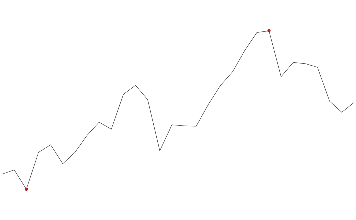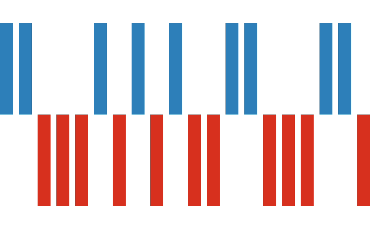
vsparkline() builds a compact, axis-free chart of a single numeric series,
sized in physical units (mm by default) so it reads as a word-sized graphic
(Tufte's sparkline) — for a table cell, a caption, or a dashboard tile. It is a
self-contained PlotSpec: render it with render_plot(), drop it into a
composition with inset(), or (soon) a table cell.
Arguments
- values
A numeric vector (the series), length >= 2.
- type
"line"(default),"bar", or"winloss".- color
Trend / bar colour. Default
"grey30".- points
For
type = "line", which points get a dot:"extremes"(default – the min and max),"last", or"none".- point_color
Dot colour (default
"firebrick").- baseline
For
"bar", the value bars grow from (default0); for"winloss", the threshold separating a win (>=) from a loss (default0).- win_color, loss_color
For
"winloss", the up / down bar colours (defaults blue / red).- linewidth
Trend line width (default
1).- point_size
Dot diameter in mm (default
1.4).- width, height, units
Physical size of the sparkline;
unitsis one of"mm"(default),"cm","in","pt". Default20 x 6mm.- dpi
Resolution for raster output.
Value
A PlotSpec.
Details
Three shapes via type: a "line" trend (with optional dots on its extremes
or last point), a "bar" column micro-chart, and a "winloss" chart of equal
up/down bars about a baseline (for streaks of wins/losses, gains/drops).
The chart fills its box with no axes, gridlines, labels, or legend.