library(gapminder)

g2007 <- subset(as.data.frame(gapminder), year == 2007)

p <- vplot(g2007, width = 7.2, height = 4.8) |>
  mark_point(x = lifeExp, y = gdpPercap, size = 1.5, alpha = 0.5) |>
  mark_outlier_label(x = lifeExp, y = gdpPercap, label = country, size = 3.4) |>
  labs(title = "Income against life expectancy, 2007",
x = "life expectancy (years)", y = "GDP per capita")Naming only the points that stand out
Text
Statistical
mark_outlier_label() keeps the rows whose y is an outlier under Tukey’s rule or an sd threshold, per colour group, and labels just those, so a 142-point scatter names its extremes instead of everything.
Labelling every point on a scatter of any size produces a wall of text that hides the data underneath it. Labelling none leaves the reader asking which country that dot in the corner is. The useful middle is to name the extremes, and the extremes are computable.
mark_outlier_label() takes the same encodings as the points, applies Tukey’s rule to y, keeps the rows that fall outside the whiskers, and labels those, repelling them apart with leader lines back to their points.
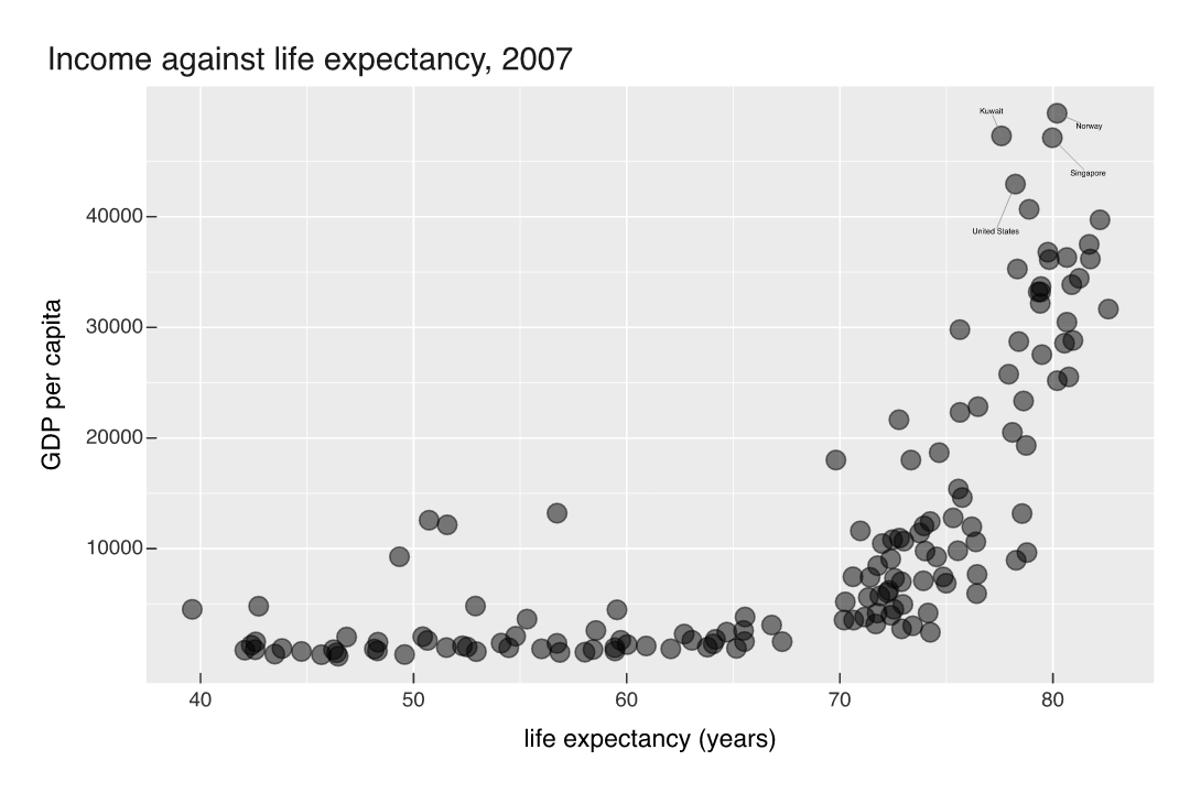
Four names out of 142 rows: Norway, Kuwait, Singapore and the United States, the only countries whose GDP per capita clears Q3 + 1.5 * IQR. Nothing was configured. Add a year of data or swap the dataset and the callouts follow the numbers rather than a list of row names you wrote by hand.
An outlier compared to what
Map a color and detection runs inside each group, which usually changes the answer entirely:
p2 <- vplot(g2007, width = 7.2, height = 4.8) |>
  mark_point(x = lifeExp, y = gdpPercap, color = continent, size = 1.5, alpha = 0.6) |>
  mark_outlier_label(x = lifeExp, y = gdpPercap, color = continent, label = country,
                     size = 3.2) |>
  labs(title = "Outliers within each continent",
       x = "life expectancy (years)", y = "GDP per capita")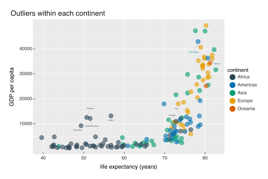
Norway, Kuwait and Singapore stop being outliers, because among rich countries and among Asian countries they have company. Six African countries become outliers instead: Botswana, Gabon, Equatorial Guinea, Libya, Mauritius and South Africa, all of them unremarkable on the global scale and far above their continent’s third quartile. Canada and the United States are outliers on both readings. The label layer is not asserting anything about the world here, it is reporting which rows the rule you chose picked out, and it is worth knowing which rule that was.
The other rule, and no label column
method = "sd" with k = 2 flags anything more than two standard deviations from the mean, which on a right-skewed variable is a much looser net than the IQR rule:
p3 <- vplot(g2007, width = 7.2, height = 4.4) |>
  mark_point(x = lifeExp, y = gdpPercap, size = 1.5, alpha = 0.5) |>
  mark_outlier_label(x = lifeExp, y = gdpPercap, label = country,
                     method = "sd", k = 2, size = 3.4) |>
  labs(x = "life expectancy (years)", y = "GDP per capita")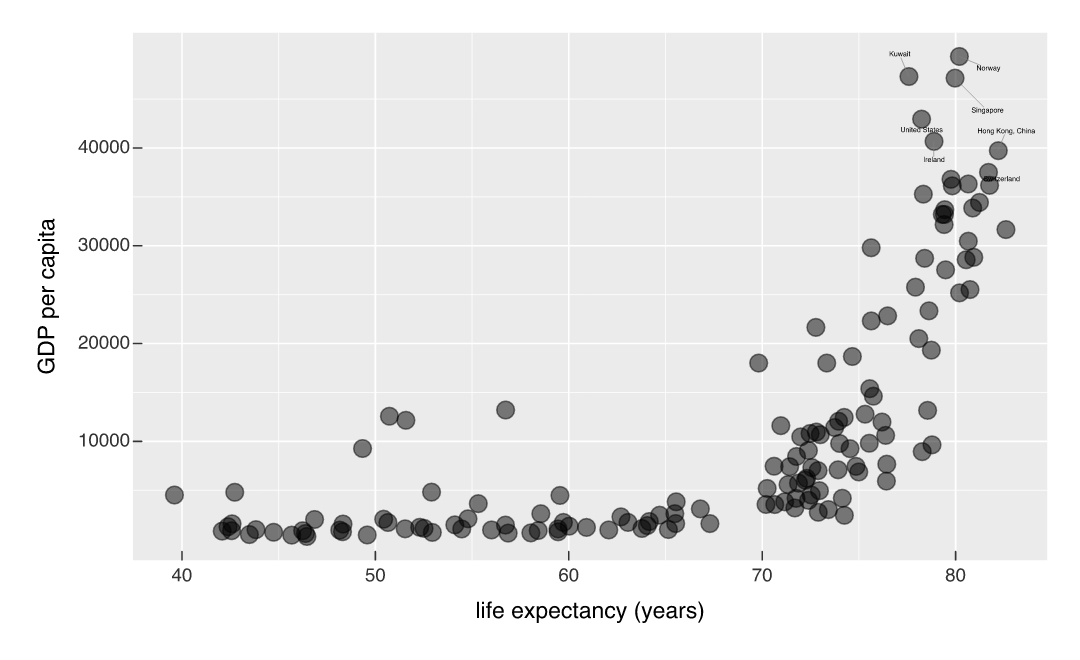
Seven names instead of four: Switzerland, Ireland and Hong Kong join the original set, because the mean and standard deviation of this variable are both pulled upward by the same handful of values the rule is trying to find. k moves the threshold either way.
Leave label unmapped and each outlier is labelled with its own y value, which is enough when the interesting thing is the magnitude rather than the name. The repelling machinery is shared with mark_text(repel = TRUE) and mark_series_label().