library(gapminder)

means <- aggregate(lifeExp ~ continent + year, gapminder, mean)

p <- vplot(means, width = 7, height = 4.5) |>
  mark_line(x = year, y = lifeExp, color = continent, linewidth = 1) |>
  mark_series_label(x = year, y = lifeExp, color = continent) |>
  xlim(1952, 2016) |>
  guides(color = "none") |>
labs(title = "Mean life expectancy by continent", y = "years", x = NULL)Labels at the ends of the lines, instead of a legend
Text
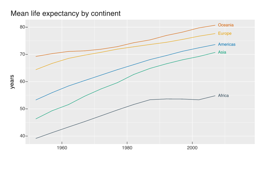
mark_series_label() names each colour series at its line end in the series colour, repelled apart with leader lines, so reading the chart never involves a round trip to a key.
A legend asks the reader to hold a colour in their head, travel to a box, find the matching swatch, read the name, and travel back. On a line chart that trip happens once per series, and it happens again every time the eye loses its place. Writing the name at the end of the line removes it.
mark_series_label() takes the same x, y and color as the lines and labels each series where it ends, in the series colour. Give the panel some room on the right and drop the legend that is now redundant.
Here is the same chart with a key instead, for the comparison:
p2 <- vplot(means, width = 7, height = 4.5) |>
  mark_line(x = year, y = lifeExp, color = continent, linewidth = 1) |>
  labs(title = "Mean life expectancy by continent", y = "years", x = NULL)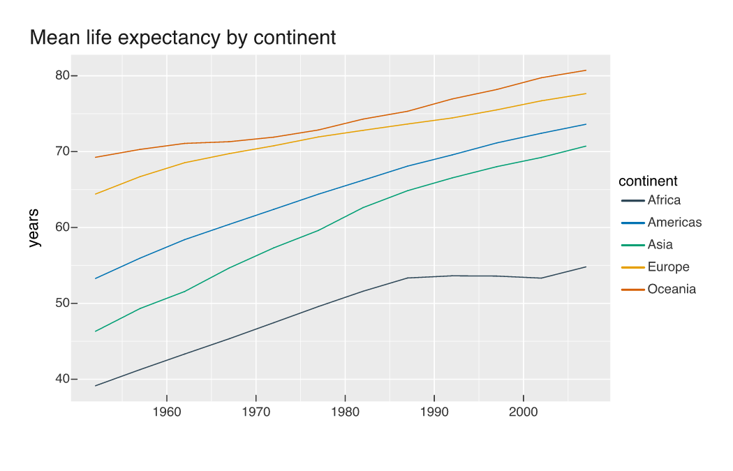
Five lines, five colours, and a box on the right that has to be consulted. The legend also lists the series in factor-level order, alphabetically here, so the top entry belongs to the bottom line.
When the ends crowd
Series that finish close together would collide, so the labels go through the same force-directed solver as mark_text(repel = TRUE): they move apart and grow a leader line back to the point they belong to when they have travelled far enough to need one.
countries <- c("Japan", "Greece", "Costa Rica", "United States", "Poland")
five <- subset(as.data.frame(gapminder), country %in% countries)
five$country <- factor(five$country, levels = countries)

p3 <- vplot(five, width = 7.2, height = 4.6) |>
  mark_line(x = year, y = lifeExp, color = country, linewidth = 1) |>
  mark_series_label(x = year, y = lifeExp, color = country) |>
  xlim(1952, 2024) |>
  guides(color = "none") |>
  labs(title = "Life expectancy, five countries", y = "years", x = NULL)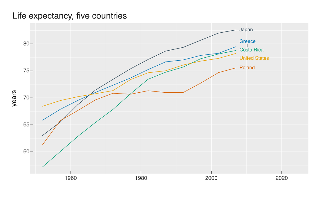
Greece, Costa Rica and the United States end within 1.3 years of each other and still read as three separate names, with a leader from Costa Rica’s label back to its line. This is also the chart that makes the case for direct labels: the story is that the United States starts highest of the five and finishes second from bottom, and following that line through the crossings is much easier when its name is attached to it.
nudge_x sets the gap between line end and label, box_padding the space the solver keeps around each label, and repel = FALSE turns the whole thing off and puts each label exactly at its line end. Ends closer together than a line of text is tall need either a taller panel or fewer series; the solver moves labels, it cannot invent room.