aq <- datasets::airquality
aq$month <- factor(month.abb[aq$Month], levels = month.abb[5:9])
warm <- rev(grDevices::hcl.colors(5, "YlOrRd"))

p <- vplot(aq, width = 8.4, height = 3.4) |>
  mark_tile(x = Day, y = month, fill = Temp) |>
  scale_fill_binned(style = "quantile", n = 5, palette = warm) |>
  labs(title = "Daily maximum temperature, New York 1973",
x = "day of month", y = NULL, fill = "°F")A colour bar with the class breaks written on it
Legends
Heatmaps
guide_coloursteps() draws a binned colour scale as one segmented bar labelled at the class boundaries, so the legend reports where the breaks fell and a change of classification style is visible in it.
A binned colour scale has two things to communicate: which colour means what, and where the class boundaries were put. The second one decides how the figure reads, and a column of detached swatches buries it in interval notation.
Start with the default legend for a binned scale. Five classes of daily maximum temperature, cut at the quintiles:
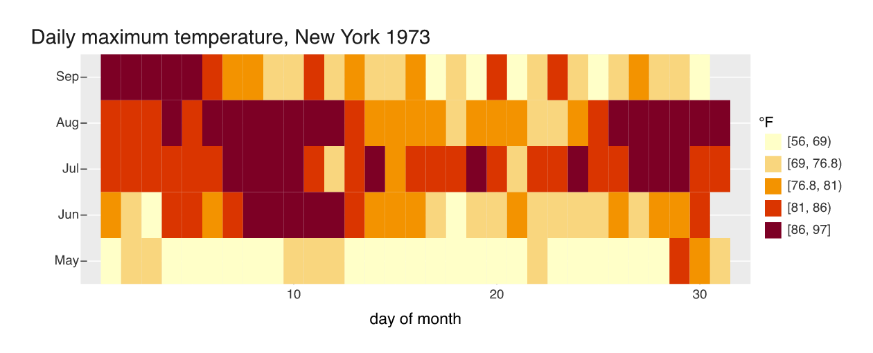
Five boxes, each labelled [a, b), and the reader parses six numbers out of five intervals to work out that the classes are not the same width.
guide_coloursteps() draws the same scale as one bar, the classes stacked in order and labelled at the boundaries between them:
p2 <- p |> guides(fill = guide_coloursteps())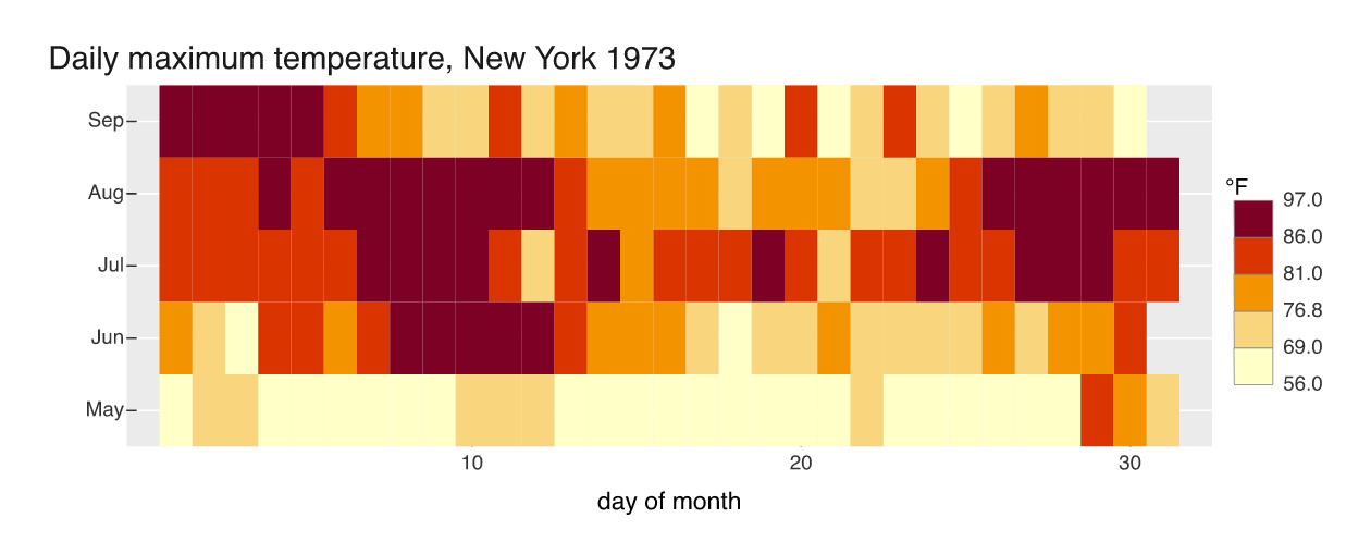
Six numbers, five bands, no brackets, and the sequence reads as a sequence because the bands touch. The boundaries are 56, 69, 76.8, 81, 86 and 97 degrees. The segments are drawn at equal height, so the bar reports the break values rather than the widths of the intervals.
The classing is a choice, and now it shows
style = "quantile" puts an equal number of days in each class, which is why the breaks bunch up between 76.8 and 86: that is where most of the summer sat. style = "equal" cuts the range into five equal widths instead:
p3 <- vplot(aq, width = 8.4, height = 3.4) |>
  mark_tile(x = Day, y = month, fill = Temp) |>
  scale_fill_binned(style = "equal", n = 5, palette = warm) |>
  guides(fill = guide_coloursteps()) |>
  labs(title = "The same days, equal-width classes",
       x = "day of month", y = NULL, fill = "°F")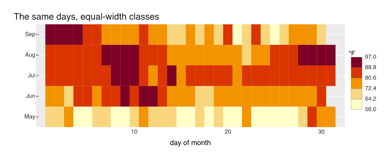
The labels are evenly spaced now (56, 64.2, 72.4, 80.6, 88.8, 97) and the summer has lost most of its contrast. Of the 62 July and August days, 36 land in the single 80.6 to 88.8 class; under the quintile breaks the same days spread 5, 17, 23 and 17 across four classes. Same data, same palette, different classing, and the bar is where you see which one you got.
style also takes "pretty", and "jenks", "fisher", "kmeans" and "headtails" when the classInt package is installed. Jenks on this variable breaks at 56, 63, 71, 79, 87 and 97, close to equal-width here but chosen to minimise within-class variance:
p4 <- vplot(aq, width = 8.4, height = 3.4) |>
  mark_tile(x = Day, y = month, fill = Temp) |>
  scale_fill_binned(style = "jenks", n = 5, palette = warm) |>
  guides(fill = guide_coloursteps()) |>
  labs(x = "day of month", y = NULL, fill = "°F")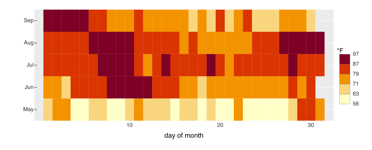
reverse flips the order of the classes, and label.position moves the numbers to the other side of the bar. For the unclassed version of the same legend, guide_colourbar() draws a smooth ramp with tick marks instead.
The classing question is the same one a choropleth faces, where the classes are regions rather than tiles: see Choropleth map and A choropleth that names its regions.