plot_svg(vsparkline(idx("DAX")),
inline = TRUE, recolor = c(grey30 = "currentColor"))Word-sized charts, inline in the text
Text
Statistical
vsparkline() draws an axis-free chart small enough to sit in a sentence. plot_svg() turns it into inline SVG that inherits the surrounding text colour.
Edward Tufte called a sparkline a “dataword”: a chart small enough to sit in a line of prose, read at a glance, and then move past. Its point is context. A number in a sentence tells you where a series ended; a sparkline next to it shows you the whole path that got there, without breaking your reading to look at a figure somewhere else on the page.
vsparkline() draws one: a numeric vector in, an axis-free plot out, sized in millimetres. plot_svg(inline = TRUE) turns that plot into an SVG made to drop into a page rather than saved as a file. Over 1991 to 1998 the German DAX and Swiss SMI more than tripled, while the French CAC and British FTSE roughly doubled; all four fell sharply in the last months of the series. Each is a live SVG, sized to the line and coloured to match the paragraph.
Two arguments make it fit the text. inline = TRUE drops the <?xml?> prolog so the <svg> is a valid fragment mid-paragraph, and a sparkline already renders on a transparent background, so it sits on the page instead of in a white box. recolor rewrites a source colour to whatever token you give it: mapping the default grey30 ink to the CSS keyword currentColor makes the browser paint the line in the current text colour, so it stays legible when the reader flips this site to dark mode.
Drop the result into the prose with an inline R expression; pandoc passes the <svg> through as raw HTML, so the chart lands mid-sentence with no figure around it. One line of CSS, p svg { vertical-align: -0.2em }, nudges it onto the text baseline.
Three shapes
vsparkline() draws three kinds of series. "line" traces a trend and marks the extremes with a dot; "bar" is a column micro-chart for counts or volumes; "winloss" reduces a series to equal up and down bars about a baseline, for streaks of binary outcomes. The figure stacks all three, built from a stock index, its monthly trading volume, and its daily up-or-down days.
i <- as.numeric(datasets::EuStockMarkets[, "DAX"])
line    <- vsparkline(i[round(seq(1, length(i), length.out = 60))], width = 55, height = 12)
bars    <- vsparkline(rpois(28, 6), type = "bar", width = 55, height = 12)
winloss <- vsparkline(sign(diff(i))[1:60], type = "winloss", width = 55, height = 12)

p <- concat(line, bars, winloss, design = "A\nB\nC")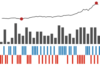
A trend callout inside a plot
annotate("sparkline", ...) drops a sparkline at a data coordinate, so a chart can carry a small trend note right where it belongs. The monthly airline passenger counts below swing wider every year, and the noise makes the trend hard to read off the points. A sparkline of the yearly totals, floated into the empty corner, states the trend the detail obscures: steady growth, no wobble.
ap <- datasets::AirPassengers
monthly <- data.frame(year = as.numeric(time(ap)), pax = as.numeric(ap))
yearly  <- as.numeric(tapply(ap, floor(time(ap)), sum))

p <- vplot(monthly) |>
  mark_line(x = year, y = pax, color = "grey55") |>
  mark_point(x = year, y = pax, size = 0.8) |>
  annotate("sparkline", x = 1951, y = 580, values = yearly,
           width = 34, height = 11, halign = "left") |>
  labs(title = "Air passengers, 1949 to 1960", x = "year", y = "monthly (thousands)")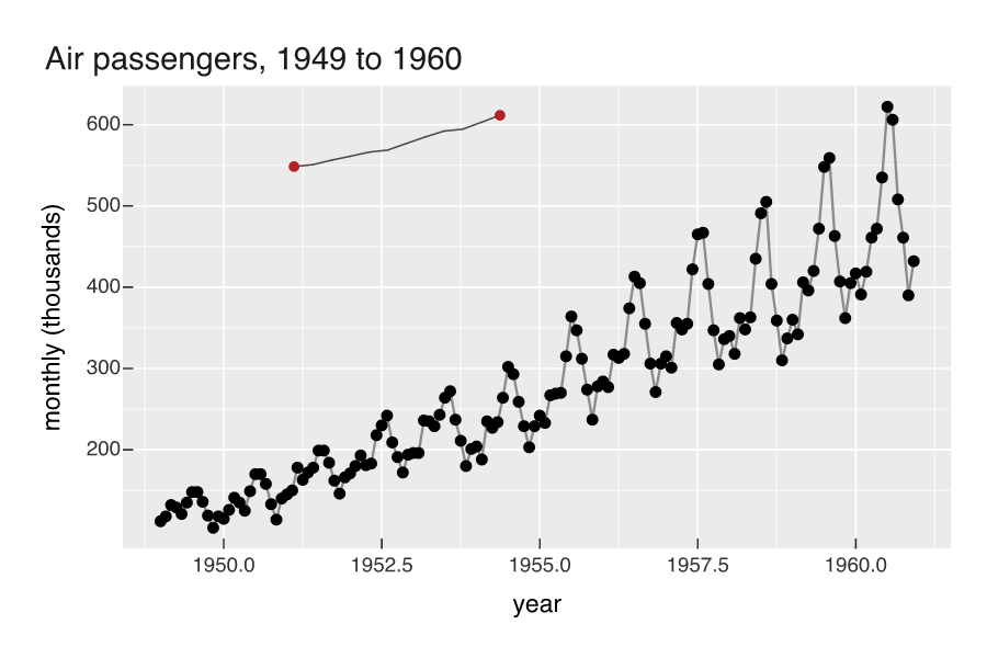
For sparklines that live in a table rather than a sentence, see sparklines in a table.