peng <- na.omit(datasets::penguins)
pairs <- list(c("Adelie", "Chinstrap"), c("Chinstrap", "Gentoo"), c("Adelie", "Gentoo"))

p <- vplot(peng, width = 6.5, height = 4.5) |>
  mark_boxplot(x = species, y = bill_dep, fill = species) |>
  mark_signif(x = species, y = bill_dep, comparisons = pairs) |>
  guides(fill = "none") |>
labs(title = "Bill depth by species", y = "bill depth (mm)")Significance brackets over a boxplot
Statistical
mark_signif() runs the pairwise test itself and draws the bracket, the p-value or the stars, stacking brackets above the data and expanding the y axis to fit them.
The bracket-and-p-value annotation over a group comparison is the most-drawn object in the life sciences, and it is usually assembled by hand: run the test, read the p-value, work out where the bracket goes, nudge it until it clears the whiskers, repeat when the data changes.
mark_signif() does the whole thing from the same encodings as the mark underneath it. Give it the comparisons you care about and it runs the test, formats the label, stacks the brackets, and expands the y scale to make room.
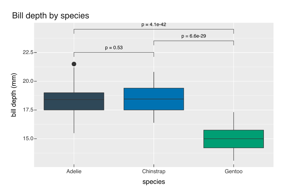
Adelie and Chinstrap bills are the same depth as far as 214 birds can tell, p = 0.53. Gentoo bills are shallower than either by about three and a half millimetres, and the p-values there are small enough that the exponent is the interesting part.
The default test is wilcox.test, and the p-values are the raw ones, with no multiplicity adjustment. Worth knowing before you draw six brackets:
wilcox.test(bill_dep ~ species, data = subset(peng, species != "Gentoo"))$p.value
#> [1] 0.5334872
That is the number on the lowest bracket. If you want Holm or BH across a family of comparisons, compute them yourself and pass the labels you want.
Stars, and a different test
label = "stars" gives the * / ** / *** / **** / ns encoding, and method switches to a t-test. Brackets sit on top of whatever distribution mark is underneath, including a raincloud:
p2 <- vplot(peng, width = 6.5, height = 4.5) |>
  mark_raincloud(x = species, y = bill_dep, color = species, alpha = 0.4) |>
  mark_signif(x = species, y = bill_dep, label = "stars",
              comparisons = list(c("Adelie", "Chinstrap"), c("Chinstrap", "Gentoo"))) |>
  guides(color = "none") |>
  labs(title = "Bill depth by species", y = "bill depth (mm)")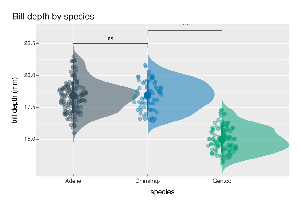
Here the annotation and the data agree about something a bracket alone would not tell you: the ns sits over two clouds with the same location and the same shape, so the non-result is a real overlap rather than a test that lacked power to separate two distinct groups.
Leave comparisons out and each adjacent pair of levels gets tested, which is the common case when the x axis is ordered:
p3 <- vplot(peng, width = 6.5, height = 4) |>
  mark_boxplot(x = species, y = bill_dep, fill = species) |>
  mark_signif(x = species, y = bill_dep) |>
  guides(fill = "none") |>
  labs(y = "bill depth (mm)")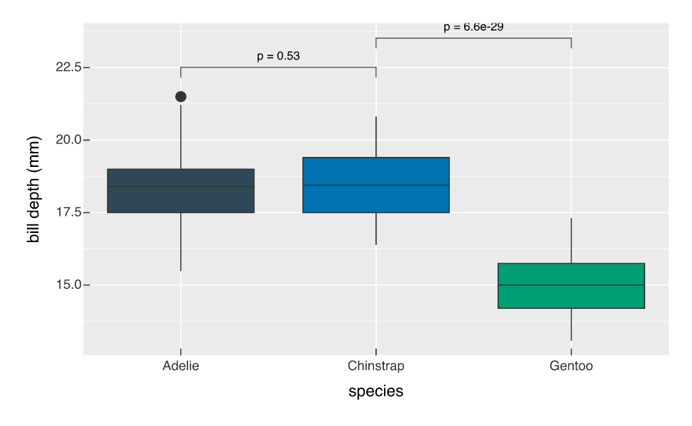
step controls the vertical gap between stacked brackets and tip_length the down-ticks at their ends, both as fractions of the y range, so they scale with the data rather than with the figure size.
Hand-drawn brackets
A bracket is a line and two ticks, which is about as well suited to theme_sketch() as geometry gets:
p4 <- vplot(peng, width = 6.5, height = 4.5) |>
  mark_violin(x = species, y = bill_dep, fill = species) |>
  mark_signif(x = species, y = bill_dep, comparisons = pairs,
              label = "stars", method = "t.test") |>
  guides(fill = "none") |>
  theme_sketch() |>
  labs(title = "Bill depth by species", y = "bill depth (mm)")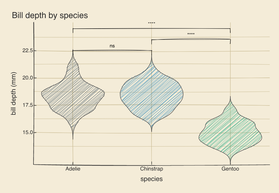
The t-test agrees with the rank test on all three comparisons here, which is what you would expect from three roughly symmetric samples of this size. When they disagree, the method argument is one keystroke and the figure redraws itself around the new labels.