peng <- na.omit(datasets::penguins)

p <- vplot(peng, width = 7, height = 4.5) |>
  mark_raincloud(x = species, y = bill_len, color = species) |>
  coord_flip() |>
  scale_y_continuous(breaks = seq(32, 60, 4)) |>
  guides(color = "none") |>
labs(title = "Bill length by species", x = NULL, y = "bill length (mm)")Rainclouds, and the sina spread underneath them
Statistical
mark_raincloud() composes a one-sided density with the raw observations spread by local density, so one band shows the shape of a distribution and every point in it.
A boxplot summarises five numbers and hides the rest, which is how bimodal data gets reported as a median. A violin shows the shape but not the sample. A raincloud draws both in one band: a one-sided density above the category line, the observations scattered below it, and a point interval on the line itself.
mark_raincloud() composes it in one call. Flip the coordinates and the clouds sit above their rain, which is the arrangement the chart is named for.
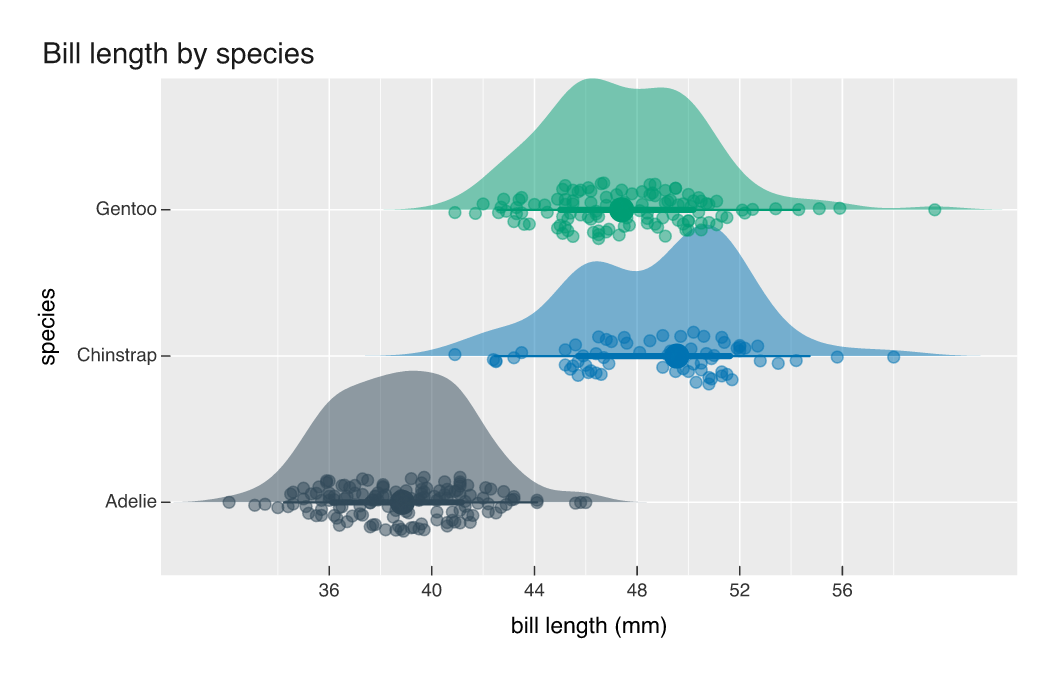
Chinstrap and Gentoo bills cover the same range (40.9 to about 59 mm) with standard deviations 0.2 mm apart, so their boxplots would look like the same box drawn twice. Their shapes differ. The Chinstrap density has two humps with a dip near 46 mm, and the rain thins out at that value; Gentoo is one broad hump with a handful of long bills trailing right.
Everything mapped in ... reaches both layers, so color = species colours the cloud, the rain, and the interval together. width sets how far the rain spreads and alpha its opacity, which is worth turning down when a group runs into the hundreds.
The rain is not jitter
The points use position_sina(). Jitter displaces each observation by a random amount inside a fixed band, so the cloud is as wide where the data is sparse as where it is dense. Sina scales each displacement by the local density instead, so the scatter narrows in the tails and the point cloud takes on the same silhouette as the violin above it. It works as a mark on its own:
p2 <- vplot(peng, width = 7, height = 3.4) |>
  mark_point(x = species, y = bill_len, color = species, position = "sina",
             alpha = 0.6, size = 2) |>
  coord_flip() |>
  guides(color = "none") |>
  labs(x = NULL, y = "bill length (mm)")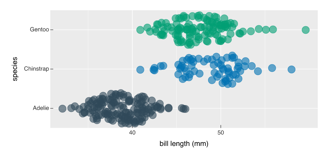
The thin patch in the middle of the Chinstrap row comes from the data rather than from the layout, because sina ties each displacement to density instead of to a random number. Whether 68 birds is enough to call that bimodal is a separate question, but jitter does not leave you the option of asking it:
p3 <- vplot(peng, width = 7, height = 3.4) |>
  mark_point(x = species, y = bill_len, color = species,
             position = position_jitter(width = 0.35), alpha = 0.6, size = 2) |>
  coord_flip() |>
  guides(color = "none") |>
  labs(x = NULL, y = "bill length (mm)")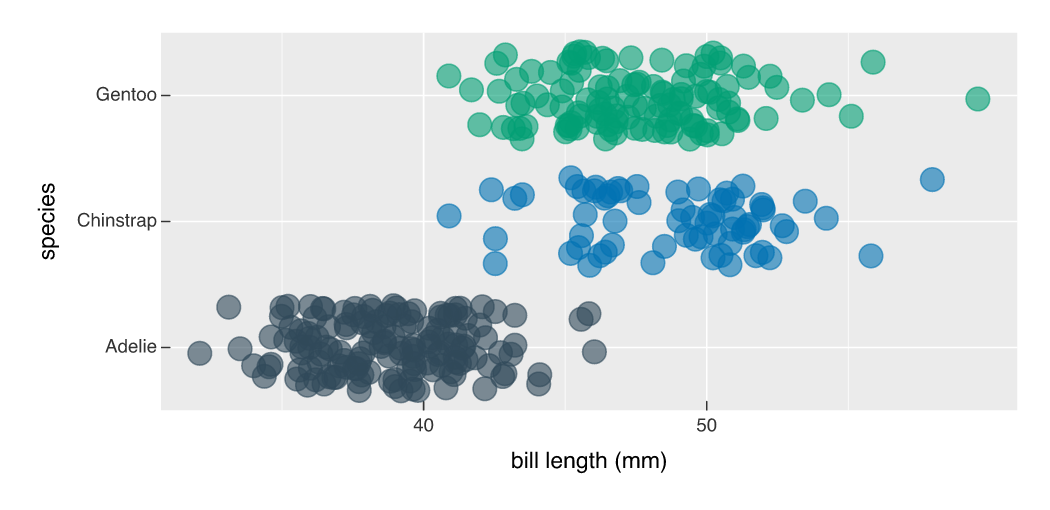
Under the sketch theme
Hand-drawn hachure suits a density better than a flat fill does, because the shading is visibly approximate and a kernel density estimate is too:
p4 <- vplot(peng, width = 7, height = 4.5) |>
  mark_raincloud(x = species, y = bill_len, color = species, alpha = 0.7) |>
  coord_flip() |>
  scale_y_continuous(breaks = seq(32, 60, 4)) |>
  guides(color = "none") |>
  theme_sketch() |>
  labs(title = "Bill length by species", x = NULL, y = "bill length (mm)")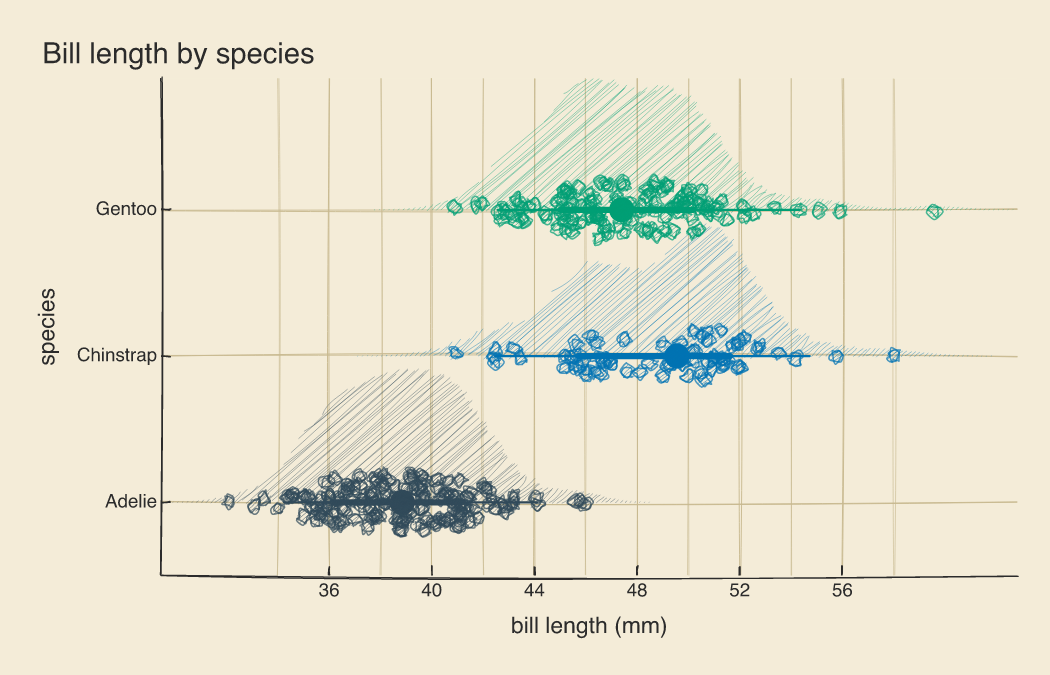
mark_raincloud() is exactly mark_halfeye() piped into mark_point(position = position_sina()), so anything you would do to those two separately still applies. See Boxplots and violins for the rest of the distribution marks.