p <- vplot(nc, width = 7.5, height = 4.4) |>
  mark_sf(fill = BIR74, color = "white", linewidth = 0.2) |>
  coord_sf(crs = 3857, graticule = TRUE) |>
  mark_scalebar(unit = "km", position = "bottomright") |>
  mark_compass(position = "topright") |>
  scale_fill_continuous() |>
  labs(title = "North Carolina births, 1974", fill = "births", x = NULL, y = NULL) |>
  theme(axis.text = element_blank(), axis.ticks = element_blank(),
axis.title = element_blank())Scale bar, north arrow, graticule
Spatial
The cartographic furniture a map needs to be readable: mark_scalebar() and mark_compass() pinned to a panel corner, and graticule lines drawn behind the map by coord_sf().
A map without a scale bar does not tell you how big anything is, and a projected map without a graticule does not tell you which way north went. Both are standard cartographic furniture and both are one pipe step here.
mark_scalebar() draws a segmented distance bar and mark_compass() a north arrow. Neither takes data aesthetics; they are fixed decorations pinned to a panel corner, in millimetres from the edge. Graticule lines are not a mark at all. They belong behind the map, so coord_sf(graticule = TRUE) draws them.
The 100 counties of North Carolina, births in 1974. The graticule carries its own degree labels, so the ordinary axis text (projected metres, which nobody wants to read) is blanked out:
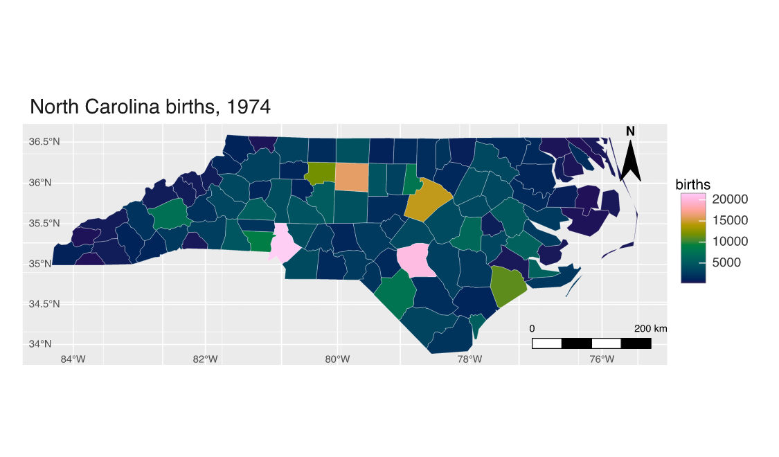
The bar picks its own round number
Left alone, mark_scalebar() chooses a round distance near a quarter of the panel width, the number a cartographer would have picked, and measures it in the panel’s projected coordinates. So it is correct for the crs you asked coord_sf() for rather than for whatever the data happened to arrive in. Set distance when you want a specific length, segments for how many alternating blocks it is divided into, and unit for "km", "m", "mi", or "ft".
p2 <- vplot(nc, width = 7.5, height = 4.4) |>
  mark_sf(fill = "#e6d9b8", color = "#6b4f2c", linewidth = 0.25) |>
  coord_sf(crs = 3857, graticule = TRUE) |>
  mark_scalebar(distance = 100, unit = "mi", segments = 2, position = "bottomright",
                height = 3, color = "#3a2f1e", fill = "#faf5ea") |>
  mark_compass(position = "topleft", size = 14, color = "#3a2f1e", fill = "#6b4f2c") |>
  labs(title = "Same map, furniture dressed to match", x = NULL, y = NULL) |>
  theme(axis.text = element_blank(), axis.ticks = element_blank(),
        axis.title = element_blank())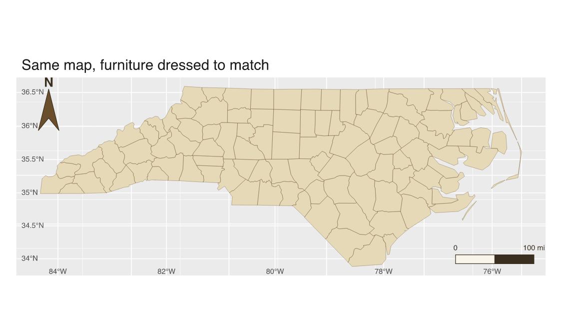
Both decorations take color and fill (the scale bar’s segments alternate between them; the compass arrow is fill with a color outline), a pad inset, and one of four corners: "bottomleft", "bottomright", "topleft", "topright", or the "bl"/"br"/"tl"/"tr" abbreviations. mark_compass() also takes a rotation, for pointing at grid north on a rotated layout, and text = FALSE if you want the arrow without the “N”.
See Choropleth map for the projection side of coord_sf(), and Interactive choropleth for the same map as a widget.