states <- data.frame(
  x = datasets::state.center$x,
  y = datasets::state.center$y,
  name = datasets::state.name,
  pop = datasets::state.x77[, "Population"]
)
states <- subset(states, !name %in% c("Alaska", "Hawaii"))

p <- vplot(states, width = 8.6, height = 4.6) |>
  mark_point(x = x, y = y, size = pop, alpha = 0.55, color = "#2f6f8f") |>
  scale_size(range = c(2, 12)) |>
  guides(size = guide_legend(nested = TRUE)) |>
  xlim(-127, -65) |>
  ylim(23, 51) |>
  theme_void() |>
labs(title = "Population by state, 1977", size = "thousands")The cartographer’s bubble legend
Legends
Spatial
guide_legend(nested = TRUE) draws a size legend as concentric bottom-aligned circles with a leader from each to its label, the proportional-symbol convention, instead of a column of stacked keys.
On a proportional-symbol map the reader’s job is to convert a circle back into a number. A stacked legend makes them compare a key against a symbol somewhere else on the page. The cartographic answer is to nest the keys: draw the circles concentric and bottom-aligned so they can be read as one ruler, with a leader from each to its value.
guide_legend(nested = TRUE) does that for a size scale. Here are the 48 contiguous US states in 1977, sized by population.
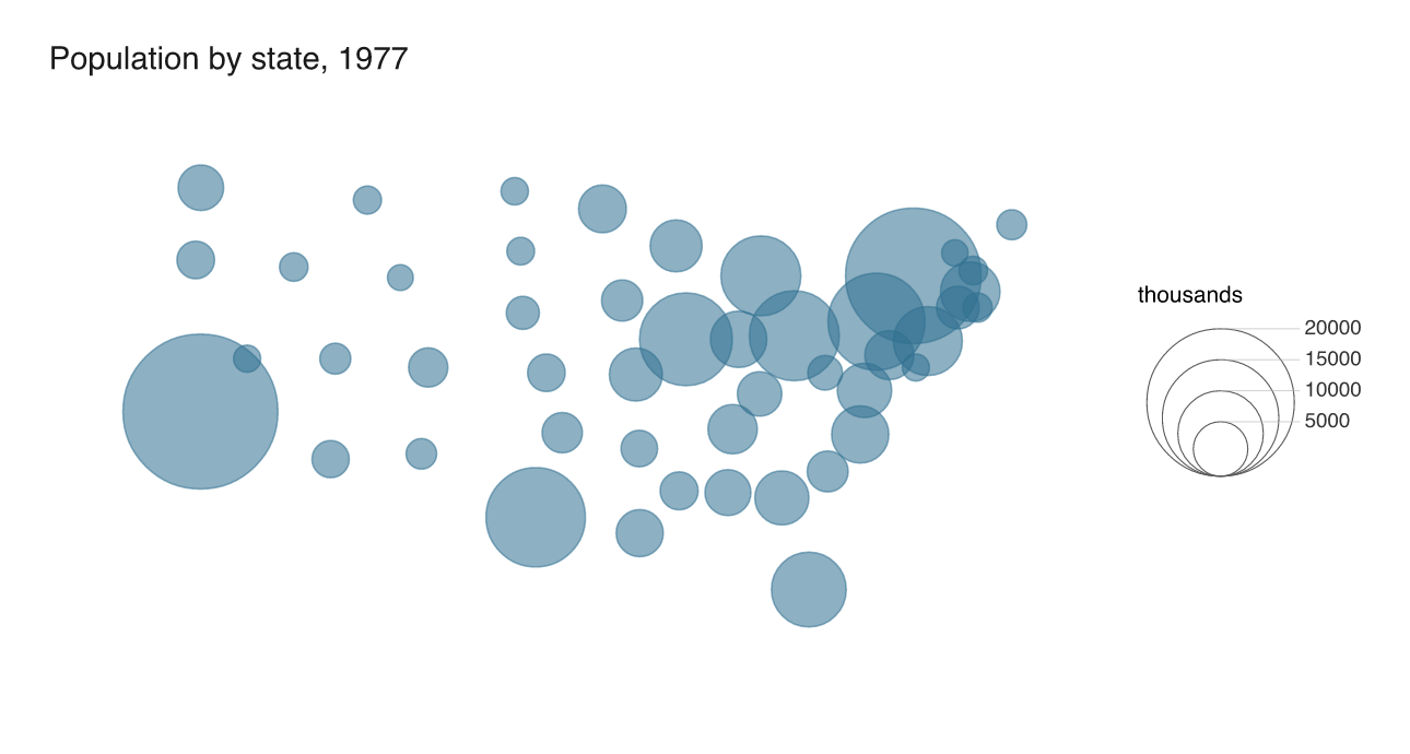
California’s 21.2 million and New York’s 18.1 million are the two circles that dominate, and the nesting lets you check a mid-sized state against the 10000 ring without leaving the legend. The keys are drawn as outlines rather than filled, which is what keeps five concentric circles legible.
Against the stacked version
The same scale as a normal size legend, with override.aes used to give the keys the layer’s colour:
p2 <- vplot(states, width = 8.6, height = 4.6) |>
  mark_point(x = x, y = y, size = pop, alpha = 0.55, color = "#2f6f8f") |>
  scale_size(range = c(2, 12)) |>
  guides(size = guide_legend(override.aes = list(color = "#2f6f8f", alpha = 0.55))) |>
  xlim(-127, -65) |>
  ylim(23, 51) |>
  theme_void() |>
  labs(title = "Population by state, 1977", size = "thousands")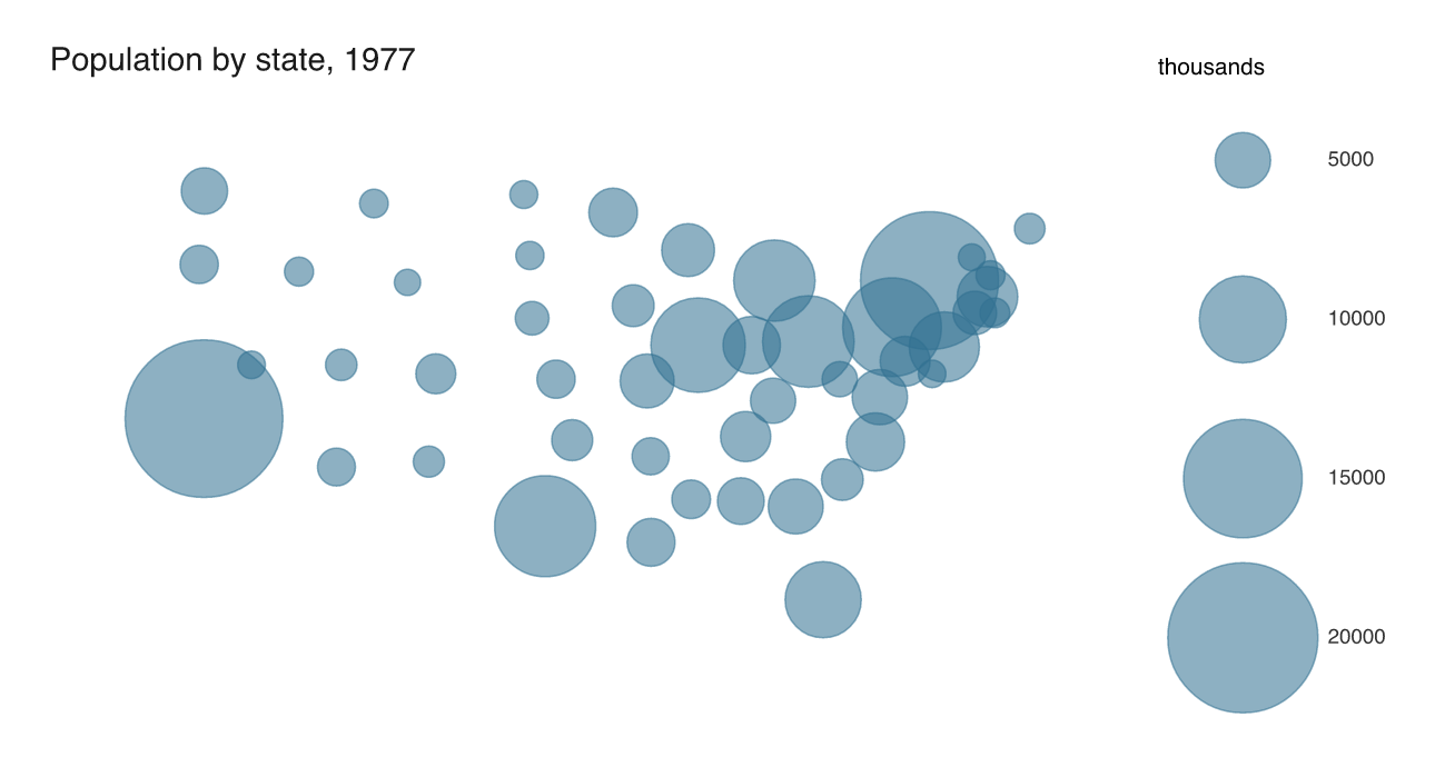
Four keys, and they occupy the full height of the figure because each circle needs its own row plus the gap that keeps the largest from touching its neighbour. Comparing 10000 with 15000 means judging two circles separated by a gap about as wide as the circles are. Nested, they share an edge.
Give it room to work
The nesting only reads if the circles differ enough to be told apart, which means a size range wide enough to spread them. Squeeze it and the labels collide:
p3 <- vplot(states, width = 8.6, height = 4.6) |>
  mark_point(x = x, y = y, size = pop, alpha = 0.55, color = "#2f6f8f") |>
  scale_size(range = c(1.5, 5)) |>
  guides(size = guide_legend(nested = TRUE)) |>
  xlim(-127, -65) |>
  ylim(23, 51) |>
  theme_void() |>
  labs(title = "The same map with range = c(1.5, 5)", size = "thousands")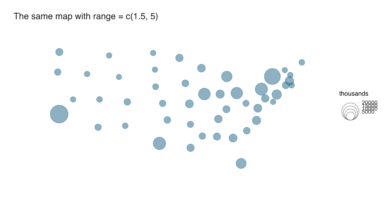
The map is still readable and the legend is not: 10000 and 15000 sit almost on the same line because their rings are less than a millimetre apart. range = c(2, 12) or wider is the working setting, which is also the range that makes the symbols worth drawing as circles in the first place.
nested applies to size legends only, and to vertical ones: a legend placed horizontally keeps its stacked keys. For the colour counterpart of a legend that reports its own scale, see A colour bar with the class breaks written on it.