spend <- data.frame(
  category = factor(rownames(USPersonalExpenditure),
                    levels = rownames(USPersonalExpenditure)),
  dollars = USPersonalExpenditure[, "1960"]
)

p <- vplot(spend, width = 5.5, height = 3.4) |>
  mark_bar(x = category, y = dollars, fill = "#c9a874") |>
labs(title = "US personal spending, 1960", x = NULL, y = "billion $")Long labels that fit
Text
Rotated and wrapping axis tick labels, titles that wrap instead of overflowing, a relative cex that cascades through the theme, and tabular figures so tick digits stop jittering.
Long category names are where axis typography stops being cosmetic. Five spending categories from datasets::USPersonalExpenditure, whose names do not come close to fitting their ticks:
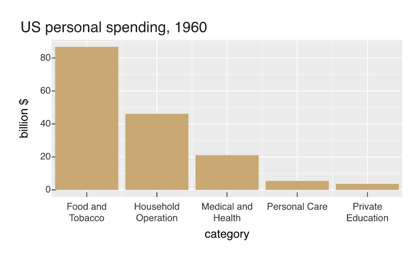
Nothing collides. A discrete label too long for its tick spacing wraps onto as many lines as it needs, and the label row grows to fit. The engine measures the text before the layout is committed, so it knows both how wide the label is and how much room the tick has. Labels that already fit are left alone.
Or rotate them
Wrapping happens at word boundaries, which means it has nothing to work with when a name is one long token. German state names are the awkward case: hyphenated, unbreakable, and 22 characters long. Slant them instead.
p2 <- vplot(laender, width = 7.5, height = 4) |>
  mark_bar(x = state, y = pop, fill = "#c9a874") |>
  theme(axis.text.x = element_text(angle = 45)) |>
  labs(title = "The same labels at 45°", x = NULL, y = "million inhabitants")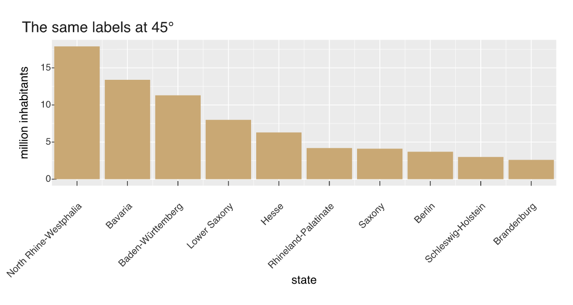
The gutter reserves the rotated height, not the horizontal one, so the labels never run into the axis title. By default the end of the run is pinned at its tick, which is the anchoring you want for a slanted label; give an explicit hjust/vjust to place it yourself.
Titles wrap too
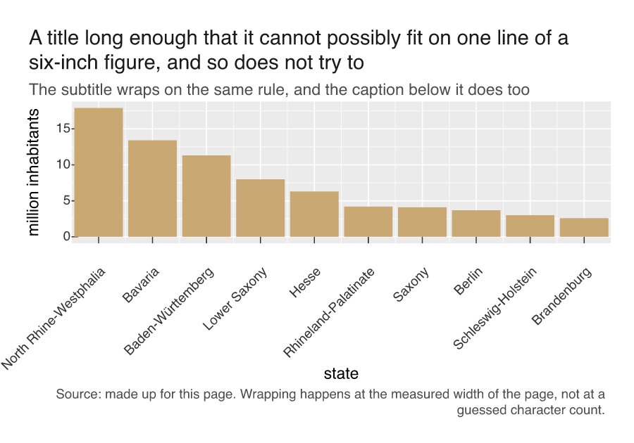
A title longer than the page used to run off it. Now it wraps, and so do subtitles and captions: the plot’s height grows to accommodate the lines rather than the text overprinting the panel.
p3 <- vplot(laender, width = 6, height = 4.2) |>
  mark_bar(x = state, y = pop, fill = "#c9a874") |>
  theme(axis.text.x = element_text(angle = 45)) |>
  labs(
    title = paste("A title long enough that it cannot possibly fit on one line",
                  "of a six-inch figure, and so does not try to"),
    subtitle = "The subtitle wraps on the same rule, and the caption below it does too",
    caption = paste("Source: made up for this page. Wrapping happens at the",
                    "measured width of the page, not at a guessed character count."),
    x = NULL, y = "million inhabitants"
  )
Sizing everything at once
element_text(cex = ) is a multiplier on the inherited size rather than an absolute value, so it cascades: set it once on text and every descendant in the theme tree scales with it. That is the difference between “make this figure’s type 20% bigger for the slide deck” being one line and being fifteen.
p4 <- vplot(laender, width = 7, height = 3.8) |>
  mark_bar(x = state, y = pop, fill = "#c9a874") |>
  theme(text = element_text(cex = 1.35),
        axis.text.x = element_text(angle = 45)) |>
  labs(title = "Everything 35% larger, from one argument", x = NULL,
       y = "million inhabitants")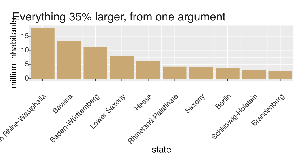
Digits that hold their column
One last detail you are more likely to notice when it is missing: axis tick labels are set with tabular figures (the OpenType tnum feature), so every digit occupies the same width. Numeric ticks line up in a column instead of shifting a fraction of a millimetre as the digits change, for the same reason a spreadsheet sets numbers in a tabular font.
counts <- data.frame(x = seq(0, 40, by = 4), y = c(1111, 1888, 2444, 3777, 4111,
                                                   5888, 6111, 7444, 8888, 9111, 10444))

p5 <- vplot(counts, width = 6.5, height = 3.4) |>
  mark_line(x = x, y = y, linewidth = 1) |>
  labs(title = "Tick digits keep a constant width", x = NULL, y = NULL)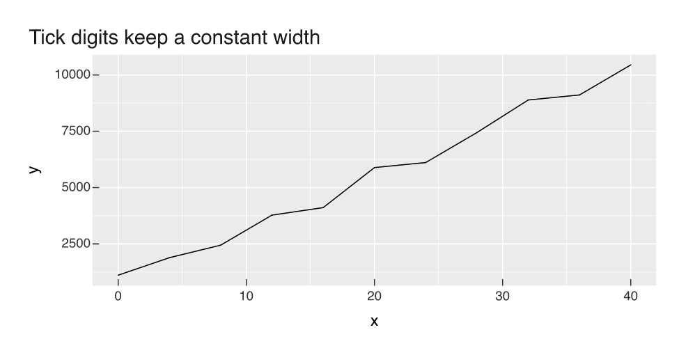
All of this rests on the same property: text is measured in the engine, with no device open, so layout decisions can depend on how big the text actually is. Rich markup in labels is a separate feature, covered in Rich text labels with md().