titanic <- as.data.frame(datasets::Titanic)
aboard <- aggregate(Freq ~ Class, titanic, sum)
aboard
#>   Class Freq
#> 1   1st  325
#> 2   2nd  285
#> 3   3rd  706
#> 4  Crew  885

p <- vwaffle(aboard, category = Class, value = Freq, width = 5.5, height = 4.4) |>
labs(title = "Everyone aboard the Titanic (2201 people)")Waffle charts, counted rather than eyeballed
Basics
vwaffle() spends a grid of 100 cells on category shares with largest-remainder allocation, so the cells always sum to the grid and a share can be read by counting squares.
Judging the angle of a pie slice is a skill nobody has. Counting squares is one everybody has. A waffle spends a fixed grid, 100 cells by default, on the categories in proportion to their size, and reading a share off it is arithmetic rather than estimation.
vwaffle() is a standalone chart in the same family as vsankey() and vvenn(): hand it a data frame, the column that colours the cells, and an optional weight. It returns a PlotSpec with no axes and a category legend.
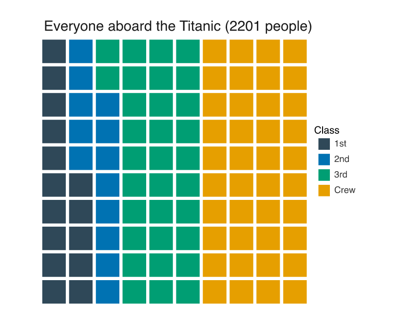
Cells fill column by column from the bottom left, so a full column is a tenth of everyone aboard. Crew take four columns, third class a shade over three, and first and second class together do not fill three.
Now the same grid for the 711 people who survived:
survived <- aggregate(Freq ~ Class, subset(titanic, Survived == "Yes"), sum)

p2 <- vwaffle(survived, category = Class, value = Freq, width = 5.5, height = 4.4) |>
  labs(title = "The 711 who survived")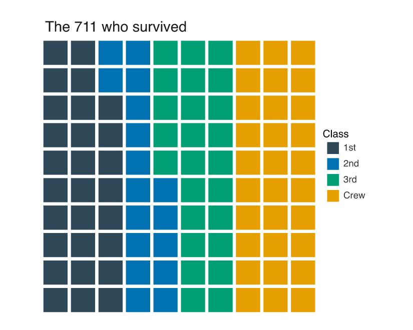
First class goes from 15 cells to 28 and crew from 40 down to 30. The two grids are the same size, so those numbers are directly comparable, which is the thing a pair of pies makes hard: your eye has to hold one set of angles while it reads another.
The cells always sum to the grid
Rounding each share independently does not add up. The survivor shares are 28.6, 16.6, 25.0 and 29.8 percent, and rounding those gives 101 cells for a 100-cell grid:
shares <- 100 * survived$Freq / sum(survived$Freq)
round(shares)
#> [1] 29 17 25 30
sum(round(shares))
#> [1] 101
vwaffle() allocates by largest remainder instead: floor every share, then hand the leftover cells to the categories the floor cut deepest. The floors here come to 98, and the two spare cells go to crew (remainder 0.8) and then to second class, which tied with first class at 0.6 and won the tie. provenance_join() reports what got drawn:
cells <- provenance_join(p2)
data.frame(class = levels(survived$Class), cells = cells$n_rows)
#>   class cells
#> 1   1st    28
#> 2   2nd    17
#> 3   3rd    25
#> 4  Crew    30
sum(cells$n_rows)
#> [1] 100
Three equal categories work out the same way, 34 and 33 and 33 rather than three 33s and a hole in the corner:
thirds <- data.frame(g = c("a", "b", "c"), n = c(1, 1, 1))
provenance_join(vwaffle(thirds, category = g, value = n))$n_rows
#> [1] 34 33 33
Grid shape, and counting rows instead of weights
n_cells and rows set the resolution, and flip fills left to right along each row instead of bottom to top along each column. Twenty-five cells in five rows is one cell per four people in a hundred, which is as coarse as this data can go and still separate first from second class:
p3 <- vwaffle(aboard, category = Class, value = Freq, n_cells = 25, rows = 5,
              flip = TRUE, width = 5, height = 4) |>
  labs(title = "One cell per 4%")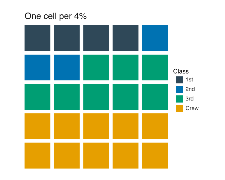
Leave value out and each row of the data counts once, so an un-aggregated table works directly:
peng <- na.omit(datasets::penguins)
p4 <- vwaffle(peng, category = species, rows = 10, width = 5.5, height = 4.4) |>
  theme_sketch() |>
  labs(title = "333 penguins, by species")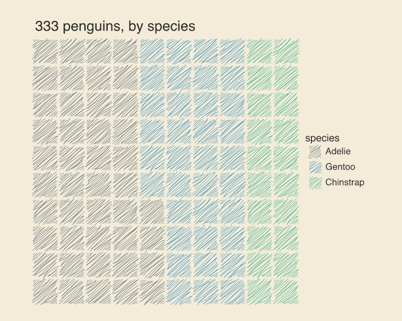
Under theme_sketch() the cells get drawn as hachured squares, which suits a chart whose point is that a cell is a rounded-off approximation of a share. theme_sketch() sketches the theme the chart already has rather than replacing it, so the waffle keeps its bare panel and no axes come back. For the angular reading of the same kind of data, see Pie and donut.