p <- vplot(pen) |>
  mark_point(x = flipper_length_mm, y = body_mass_g, size = 1.8, color = "#2b6cb0") |>
  add_marginal() |>
labs(title = "Flipper length vs. body mass", x = "flipper (mm)", y = "mass (g)")Marginal distributions
Statistical
add_marginal() draws the x and y distributions along the panel edges, aligned to the scatter. Density or histogram, pooled or split by group.
A scatter shows how two variables move together but says nothing about what each one does on its own. add_marginal() puts that back: it draws the distribution of x along the top edge and of y along the right edge, on the panel’s own axes so they line up with the cloud. It is a plot-level modifier, like facet_wrap(), and reads x and y straight from the mark_point() layer.
The data is the 333 complete Palmer Penguins.
Pooled
With no arguments it adds a kernel density to both edges.
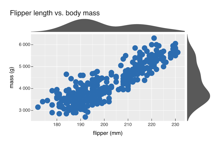
The top curve is faintly bimodal and the right one clearly so, a hint that the penguins fall into groups the pooled view hides.
Split by group
Map color to a discrete variable and pass group = TRUE, and each edge splits into one curve per group in the matching colour. Bill length against depth is the case worth seeing: pooled, the two measurements look unrelated, but the per-species marginals show Adelie, Chinstrap and Gentoo separating cleanly on both axes.
p <- vplot(pen) |>
  mark_point(x = bill_length_mm, y = bill_depth_mm, color = species, size = 1.8) |>
  add_marginal(group = TRUE) |>
  labs(title = "Bill dimensions by species", x = "length (mm)", y = "depth (mm)")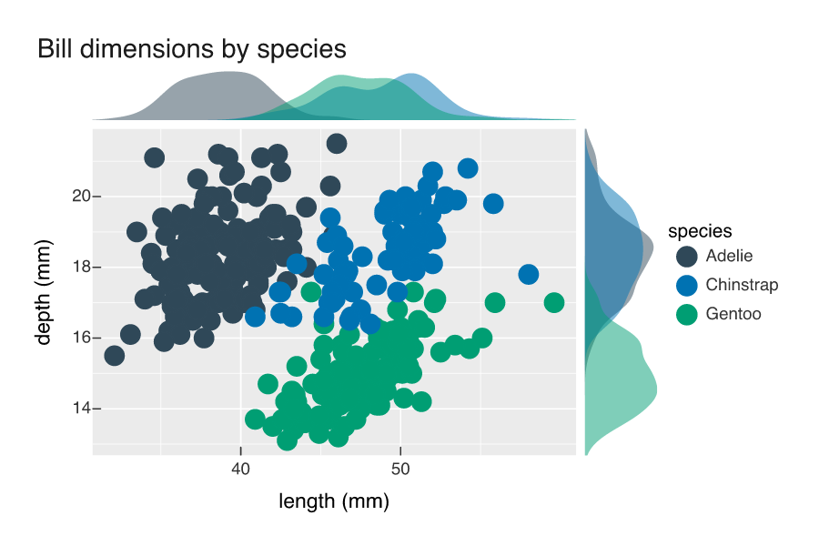
Histograms instead
Set type = "histogram" for binned counts rather than a smooth curve; bins sets the count and sides picks the edges ("t", "r", or "tr").
p <- vplot(pen) |>
  mark_point(x = flipper_length_mm, y = body_mass_g, color = species, size = 1.8) |>
  add_marginal(type = "histogram", group = TRUE) |>
  labs(title = "Histogram marginals", x = "flipper (mm)", y = "mass (g)")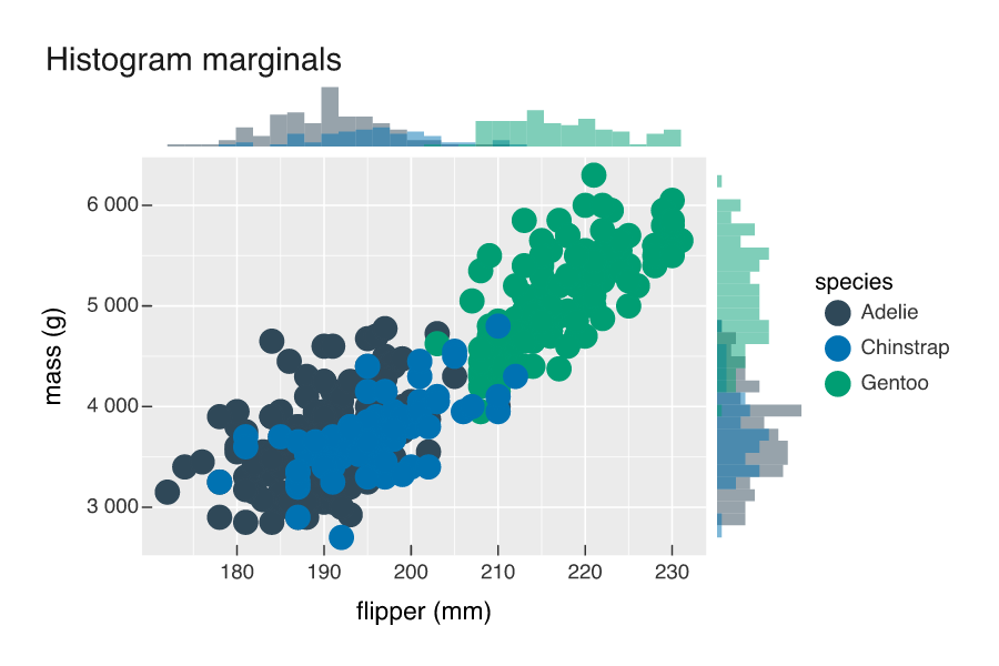
add_marginal() works on a single Cartesian panel, so it does not combine with faceting or a fixed coordinate system.