The US Census, all 306 million points
The showcase for mark_datashade(): one point per person from the 2010 US Census, about 306 million rows, rendered as a map. It reproduces datashader’s census example with vellumplot.
This example is not run when the site is built. It needs the arrow and dplyr packages and a one-time ~1.44 GB download, and it wants several GB of RAM for the full dataset. The images below are the real output, rendered once at 6000 × 4200 px and committed with the site. The script below is the exact, runnable source (inst/examples/19-datashader-census.R in vellumplot).
Population density
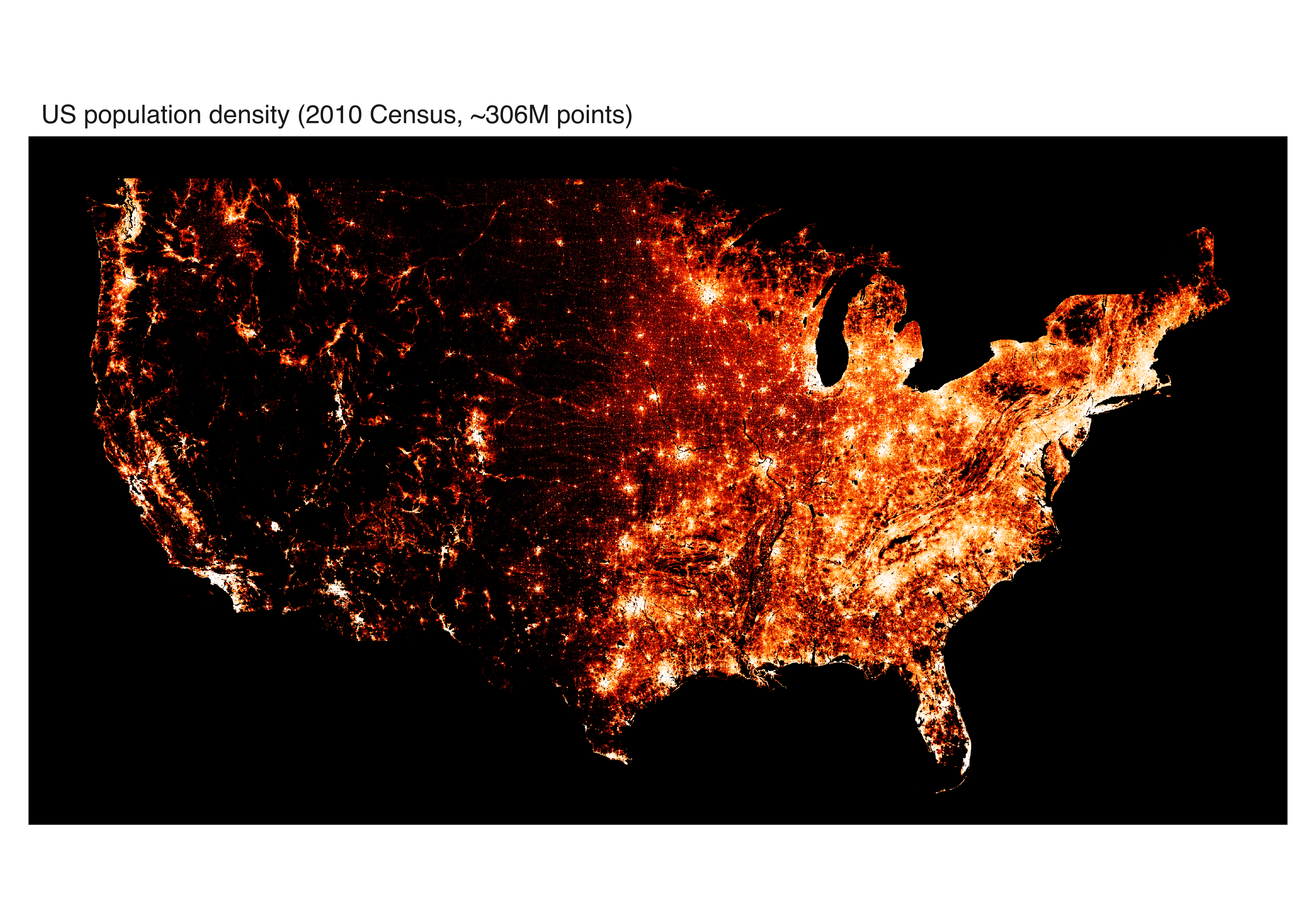
Every person, coloured by local density on a single ramp: the classic “where do people live” map. how = "eq_hist" (histogram equalisation) spreads the wide dynamic range across the colour ramp so both empty plains and dense cities stay legible.
Coloured by race
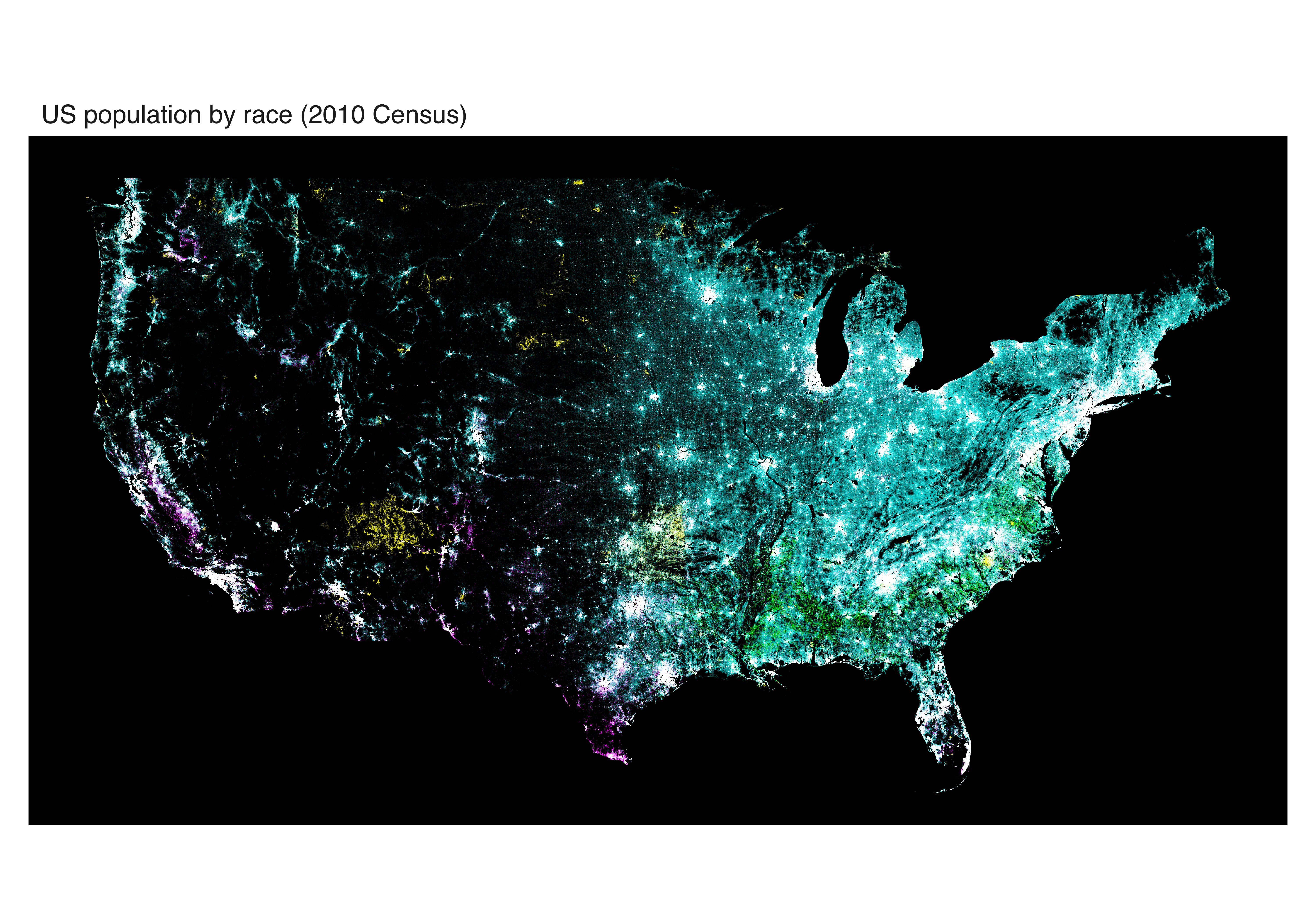
There is no single-call categorical shading, so this reproduces datashader’s count_cat by hand: one mark_datashade() layer per race, each ramping from black to its own hue, all composited additively with blend = "screen". Where populations overlap, the hues mix.
The script
The full source, verbatim. It aggregates at gw = 5000 cells across the contiguous-US window and renders a 6000 px-wide page so the datashade raster is drawn close to 1:1.
# Reproducing datashader's US Census example (https://examples.holoviz.org/
# gallery/census/census.html) with vellumplot.
#
# One point per person from the 2010 US Census (~306 million rows). We datashade
# them two ways: (1) population density on a single ramp, and (2) coloured by
# race -- one datashade layer per race with its own hue, composited additively
# with blend = "screen" (vellumplot has no single-call categorical shading, so
# this reproduces datashader's `count_cat` by hand).
#
# REQUIREMENTS (none are vellumplot dependencies -- this is a heavy showcase):
#   * packages `arrow` and `dplyr` (to read the Parquet dataset)
#   * a ~1.44 GB one-time download (cached locally after the first run)
#   * plenty of RAM for the full dataset (~6 GB collected). Set `n_max` below to
#     a few million first to smoke-test on a spatial subset before going full.
#
# Data: easting/northing are Web Mercator metres (EPSG:3857); race is a single
# char w/b/a/h/o (White/Black/Asian/Hispanic/Other).

library(vellumplot)

if (
  !requireNamespace("arrow", quietly = TRUE) ||
    !requireNamespace("dplyr", quietly = TRUE)
) {
  message(
    "19-datashader-census: skipped (needs the 'arrow' and 'dplyr' packages)"
  )
} else {
  outdir <- "figures"
  dir.create(outdir, showWarnings = FALSE)

  # --- 0. Fetch + unzip the Parquet dataset (once) ---------------------------
  data_url <- "https://s3.amazonaws.com/datashader-data/census2010.parq.zip"
  zip_path <- "census2010.parq.zip"
  parq_dir <- "census2010.parq"
  if (!dir.exists(parq_dir)) {
    if (!file.exists(zip_path)) {
      message("Downloading census2010.parq.zip (~1.44 GB, one time)...")
      # large file: raise the timeout and use a mode that handles big downloads
      options(timeout = max(3600, getOption("timeout")))
      utils::download.file(data_url, zip_path, mode = "wb")
    }
    utils::unzip(zip_path) # -> census2010.parq/ (a Parquet dataset directory)
  }

  # --- 1. Read easting / northing / race -------------------------------------
  # Set n_max to a finite number to test on a spatial subset (the data is
  # spatially sorted, so head(n) is a coherent region), or Inf for all ~306M.
  n_max <- Inf

  ds <- arrow::open_dataset(parq_dir)
  q <- dplyr::select(ds, easting, northing, race)
  if (is.finite(n_max)) {
    q <- head(q, n_max)
  }
  census <- dplyr::collect(q)
  census$race <- as.character(census$race)
  message("Loaded ", format(nrow(census), big.mark = ","), " points")

  # Contiguous-US window in Web Mercator metres (matches the datashader example).
  usa_x <- c(-13884029, -7453304)
  usa_y <- c(2818291, 6335972)
  # raster grid sized to the window's aspect so the map is not stretched.
  # gw is the datashade aggregation resolution: it -- not dpi -- sets how much
  # detail the shaded map actually contains. dpi only rescales the finished
  # raster, so a high dpi over a small gw just upsamples (blurry). For a genuine
  # high-res export, raise gw AND give the page enough pixels (width * dpi) that
  # the panel is at least gw wide so the raster is drawn 1:1, not stretched.
  gw <- 5000L
  gh <- as.integer(gw * diff(usa_y) / diff(usa_x))

  # --- 2. Population density (single ramp) -----------------------------------
  # Every person, coloured by local density -- the classic "where do people
  # live" map. eq_hist spreads the enormous dynamic range across the ramp.
  # width * dpi = 10 * 600 = 6000 px page, comfortably above gw so the panel
  # (smaller than the page after margins) draws the 5000-wide datashade raster
  # without upscaling. Bump gw + these together for even more.
  vplot(census, width = 10, height = 7, dpi = 600) |>
    mark_datashade(
      x = easting,
      y = northing,
      width = gw,
      height = gh,
      colors = c("#111111", "#8E0001", "#F81200", "#FFA50E", "#FFFFFF"),
      # c("black", "#440154", "#31688e", "#35b779", "#fde725"),
      how = "eq_hist"
    ) |>
    scale_x_continuous(limits = usa_x) |>
    scale_y_continuous(limits = usa_y) |>
    coord_fixed() |>
    theme_void() |>
    set_theme(panel_bg = "black") |>
    labs(title = "US population density (2010 Census, ~306M points)") |>
    render_plot(file.path(outdir, "19-census-density.png"))

  # --- 3. Coloured by race (additive per-category shading) -------------------
  # One datashade layer per race, each ramping black -> its hue, all composited
  # with blend = "screen" so overlapping populations mix additively -- the same
  # result as datashader's count_cat aggregation. Hues follow the datashader
  # census palette. On a black panel, screen blending shows each hue at full
  # strength and blends them where groups overlap.
  race_hue <- c(
    w = "#00ffff", # White  - aqua
    b = "#00ff00", # Black  - lime
    a = "#ff0000", # Asian  - red
    h = "#ff00ff", # Hispanic - fuchsia
    o = "#ffff00" # Other  - yellow
  )

  p <- vplot(census, width = 10, height = 7, dpi = 600) |>
    scale_x_continuous(limits = usa_x) |>
    scale_y_continuous(limits = usa_y) |>
    coord_fixed() |>
    theme_void() |>
    set_theme(panel_bg = "black") |>
    labs(title = "US population by race (2010 Census)")

  for (code in names(race_hue)) {
    p <- mark_datashade(
      p,
      x = easting,
      y = northing,
      data = census[census$race == code, , drop = FALSE],
      width = gw,
      height = gh,
      colors = c("black", race_hue[[code]]),
      how = "eq_hist",
      blend = "screen"
    )
  }
  render_plot(p, file.path(outdir, "19-census-race.png"))

  message("19-datashader-census: wrote 2 figures to ", outdir)
}